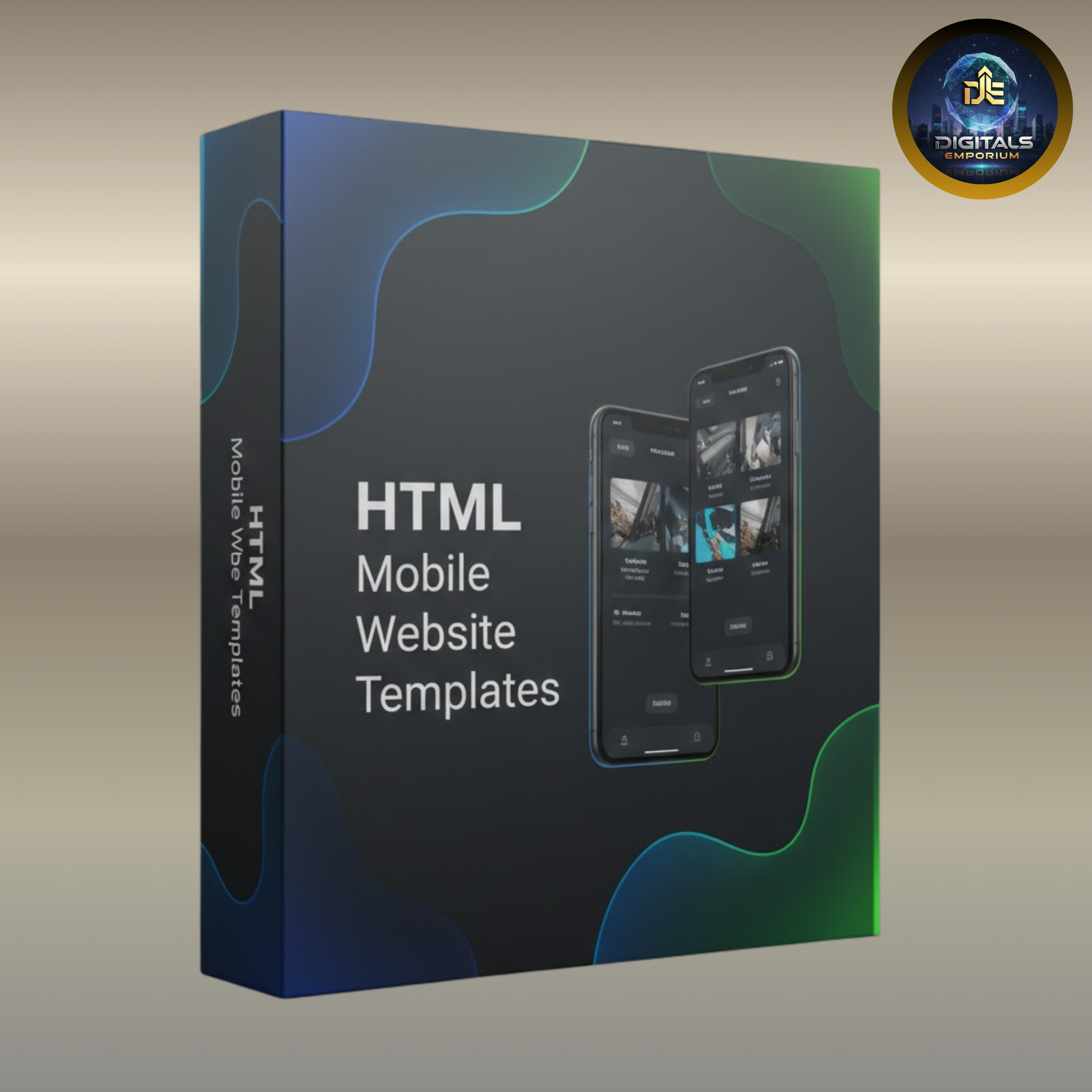
HTML Mobile Website Templates

Instant Download

Get Reseller Access

After Sale Support

Limited Time Offer
HTML Mobile Website Templates দিয়ে আপনার website-কে করুন fast, responsive ও mobile-ready.
এই templates গুলো HTML5 & CSS3 দিয়ে তৈরি, যা eCommerce, portfolio, blog ও corporate websites-এর জন্য ideal.
Fully responsive layout, easy customization এবং cross-browser compatibility নিশ্চিত করে smooth user experience সব device-এ.
Product Features
- 📱 Fully Responsive Design – Mobile, tablet ও desktop সব device-এ perfect viewing experience
- ⚡ Mobile-First & Fast Performance – Smooth navigation, no pinch-zoom, no awkward scrolling
- 🧩 Versatile Templates – eCommerce, portfolio, blog, startup ও corporate websites-এর জন্য suitable
- 🧑💻 Clean HTML5 & CSS3 Code – Modern web standards অনুসরণ করা optimized, lightweight coding
- 🎨 Easy Customization – Colors, fonts, layouts ও sections সহজেই customize করা যায়
- 🛠️ Beginner & Developer Friendly – Simple structure, easy setup & flexible editing
- 🌐 Cross-Browser Compatibility – Chrome, Firefox, Safari ও major browsers supported
- 🚀 SEO-Friendly Structure – Better loading speed ও improved search visibility
- 📐 Adaptive Layouts – Different screen size ও resolution অনুযায়ী automatic adjustment
- 💼 Professional & Modern UI – Clean, stylish design যা strong brand impression তৈরি করে
Create a modern, professional website quickly and effortlessly.
৳ 4,499 Original price was: ৳ 4,499.৳ 999Current price is: ৳ 999.
HTML Mobile Website Templates
Instant Download
Get Reseller Access

After Sale Support
Limited Time Offer
HTML Mobile Website Templates দিয়ে আপনার website-কে করুন fast, responsive ও mobile-ready.
এই templates গুলো HTML5 & CSS3 দিয়ে তৈরি, যা eCommerce, portfolio, blog ও corporate websites-এর জন্য ideal.
Fully responsive layout, easy customization এবং cross-browser compatibility নিশ্চিত করে smooth user experience সব device-এ.
Product Features
- 📱 Fully Responsive Design – Mobile, tablet ও desktop সব device-এ perfect viewing experience
- ⚡ Mobile-First & Fast Performance – Smooth navigation, no pinch-zoom, no awkward scrolling
- 🧩 Versatile Templates – eCommerce, portfolio, blog, startup ও corporate websites-এর জন্য suitable
- 🧑💻 Clean HTML5 & CSS3 Code – Modern web standards অনুসরণ করা optimized, lightweight coding
- 🎨 Easy Customization – Colors, fonts, layouts ও sections সহজেই customize করা যায়
- 🛠️ Beginner & Developer Friendly – Simple structure, easy setup & flexible editing
- 🌐 Cross-Browser Compatibility – Chrome, Firefox, Safari ও major browsers supported
- 🚀 SEO-Friendly Structure – Better loading speed ও improved search visibility
- 📐 Adaptive Layouts – Different screen size ও resolution অনুযায়ী automatic adjustment
- 💼 Professional & Modern UI – Clean, stylish design যা strong brand impression তৈরি করে
Create a modern, professional website quickly and effortlessly.
৳ 4,499 Original price was: ৳ 4,499.৳ 999Current price is: ৳ 999.
Description
HTML Mobile Website Templates – Modern, Fast & Responsive Web Solution
আপনার website-কে mobile-ready, fast ও visually stunning করতে নিয়ে আসুন আমাদের HTML Mobile Website Templates. Mobile, tablet কিংবা desktop—সব device-এ seamless browsing experience নিশ্চিত করার জন্য প্রতিটি template precision ও modern design principles অনুসরণ করে তৈরি করা হয়েছে।
এই templates গুলো versatile design মাথায় রেখে তৈরি, যা eCommerce websites, portfolios, blogs, startups ও corporate websites—সব ধরনের use-case-এর জন্য উপযোগী। প্রতিটি template HTML5 ও CSS3 ব্যবহার করে clean ও optimized code-এ তৈরি, যা performance, compatibility ও long-term stability নিশ্চিত করে।
Fully Responsive & User-Friendly Design
Mobile-first approach অনুসরণ করে প্রতিটি template বিভিন্ন screen size ও resolution অনুযায়ী automatically adapt করে। ফলে pinch-zoom বা awkward scrolling ছাড়াই visitors পায় smooth, user-friendly navigation এবং improved user experience.
Easy Customization & Brand Flexibility
Customization এখানে সহজ ও hassle-free। Colors, fonts, layouts ও sections সহজেই edit করে আপনার brand identity ও creative vision অনুযায়ী website personalize করতে পারবেন। আপনি seasoned developer হোন বা beginner—intuitive structure আপনাকে দ্রুত professional-looking website তৈরি করতে সাহায্য করবে।
Future-Ready Web Design
Rapidly evolving web design world-এ এগিয়ে থাকতে প্রয়োজন performance-driven ও scalable templates। আমাদের HTML Mobile Website Templates আপনার online presence শক্তিশালী করে, audience engage করে এবং conversions বাড়াতে সহায়তা করে।
Product Features
- 📱 Fully Responsive Design – Mobile, tablet ও desktop সব device-এ perfect viewing experience
- ⚡ Mobile-First & Fast Performance – Smooth navigation, no pinch-zoom, no awkward scrolling
- 🧩 Versatile Templates – eCommerce, portfolio, blog, startup ও corporate websites-এর জন্য suitable
- 🧑💻 Clean HTML5 & CSS3 Code – Modern web standards অনুসরণ করা optimized, lightweight coding
- 🎨 Easy Customization – Colors, fonts, layouts ও sections সহজেই customize করা যায়
- 🛠️ Beginner & Developer Friendly – Simple structure, easy setup & flexible editing
- 🌐 Cross-Browser Compatibility – Chrome, Firefox, Safari ও major browsers supported
- 🚀 SEO-Friendly Structure – Better loading speed ও improved search visibility
- 📐 Adaptive Layouts – Different screen size ও resolution অনুযায়ী automatic adjustment
- 💼 Professional & Modern UI – Clean, stylish design যা strong brand impression তৈরি করে
আজই তৈরি করুন একটি mobile-optimized, modern ও high-performing website, যা আপনার brand-এর জন্য long-lasting impression তৈরি করবে। Experience the future of web design with our premium HTML Mobile Website Templates.
Roselle –
This product is great!